
Branding Case Study: Resolute Brewing Co
If you are interested on doing a rebrand or creating a brand from scratch for your new business adventure, this post will give you an idea of what's involved during the design process.
Resolute Brewing became a client thanks to a recommendation from a dear designer friend, and it was a dream project for me, not only because it was a great design challenge, but also because of the subject. I love beer! and as a craft beer fan, I pay special attention to this industry, their visual flexibility, and their thirst for innovation. Designing a new brewery brand from scratch was a golden carbonated opportunity for me.
When I do branding projects, I ask a lot of questions, because I truly want (need) to understand what you are looking for in your business, all the whys behind it, and what your expectations and needs are, so together, we can create the best solution to your needs
The partners at Resolute had done their homework. They came to me with a clear idea of who they were as a company, why they were doing this, and who they wanted to target. So, I gathered all that information and right away moved on to step 1, writing a creative brief:
STEP 1
The creative brief = your brand's foundation
Based on the information they provided, I developed a creative brief with more details. Below is a synopsis of that brief, with key information that was included in every presentation, to serve as a reminder of what we were looking for and their brand essence.

Sinopsis of creative brief
STEP 2
We play with words
With a finalized creative brief, we worked on a word map. Sometimes this is done with post-its, sometimes digitally. Techniques vary, but the goal is the same.
On a word map, we lay out the key concepts that represent the brand. This helps narrow down ideas to single words, using visual hierarchy, therefore making it more specific. In addition to this, you can find connections between concepts, which helps define them and allows us to clearly identify the most important concepts to consider.

Word map
STEP 3
Create a vision, so you know where to go
Inspired and guided by the word map and the creative brief, we gathered visual examples that expressed and represented those concepts and values. This is called a mood board or “vision board” and it helps define the brand visually to make sure the design we will be creating aligns with the brand’s personality, values and goals. Mood boards serve as inspiration and guidance:

Mood board
STEP 4
Let's see some designs!
Even though the first 3 steps are essential and probably the most important part of the process, in step 4 is when you really will get excited, because that's when you will see your company’s logo come to life.
Branding projects usually have a set amount of revisions, so it's important to take the time to consciously review the designs.
In the first presentation, I always show logos in black and white only. The reason for this is so you can focus on the shape and concept of the logo first, without being influenced by color choices.
The human eye sees shape first, then color, but color has a very deep emotional effect on us, so it’s important to separate those two stages, to make the right decisions for your company.
It's not about personal styles, your or my personal taste, it's about what's needed for that project, for your business and for the brand.
Round 1 of designs
The first round of designs is the perfect opportunity to explore different paths and alternatives. Even though all the designs are based and inspired by the same creative brief, word map and mood board, there’s always different ways to express those concepts.
In this case, each alternative was focused on one concept more than others, and all included a 1x1 format:
Alternative 1 (Round 1)
Inspired by a navigation compass used for sailing and by thermometers used during the beer making process. This modern design resonated with the idea of a company that grows and “navigates” using strong values and commitment to the community as their guidance. A modern san-serif typography is well balanced with the compass symbol, bringing visual stability and hierarchy to the logo.
Alternative 2 (Round 1)
This modern alternative was inspired by “the science of beer making” and the concept of precision. The spelling of the name and the letters are used as graphic elements, which combined with geometric forms, representing the mountains of Colorado, created a clean, honest, and easy to identify logo.
Alternative 3 (Round 1)
This design was inspired by western graphics, but with a modern. The arrows are made of barley, to represent not only beer making, but also direction, strength, wisdom, and courage, as well as the idea of collaboration. These arrows/barleys are surrounded by key symbols: the letter “R” for Resolute, a heart for generosity and passion (helping others, the idea of family and friends, passion for beer making, and helping the community), a beer mug to represent craft brewing, and a hop plant as an essential beer making ingredient.

Alternative 3 (Round 1)
This design was based on the concept of “principled”, represented through a "signature" style logo, as a unique visual representation of a person. Comes from the idea of “putting your name on it”, making a promise and signing a commitment, which resonated with the strong values of Resolute towards the community. A great beer would have the brewery “signature” as a high-quality stamp.
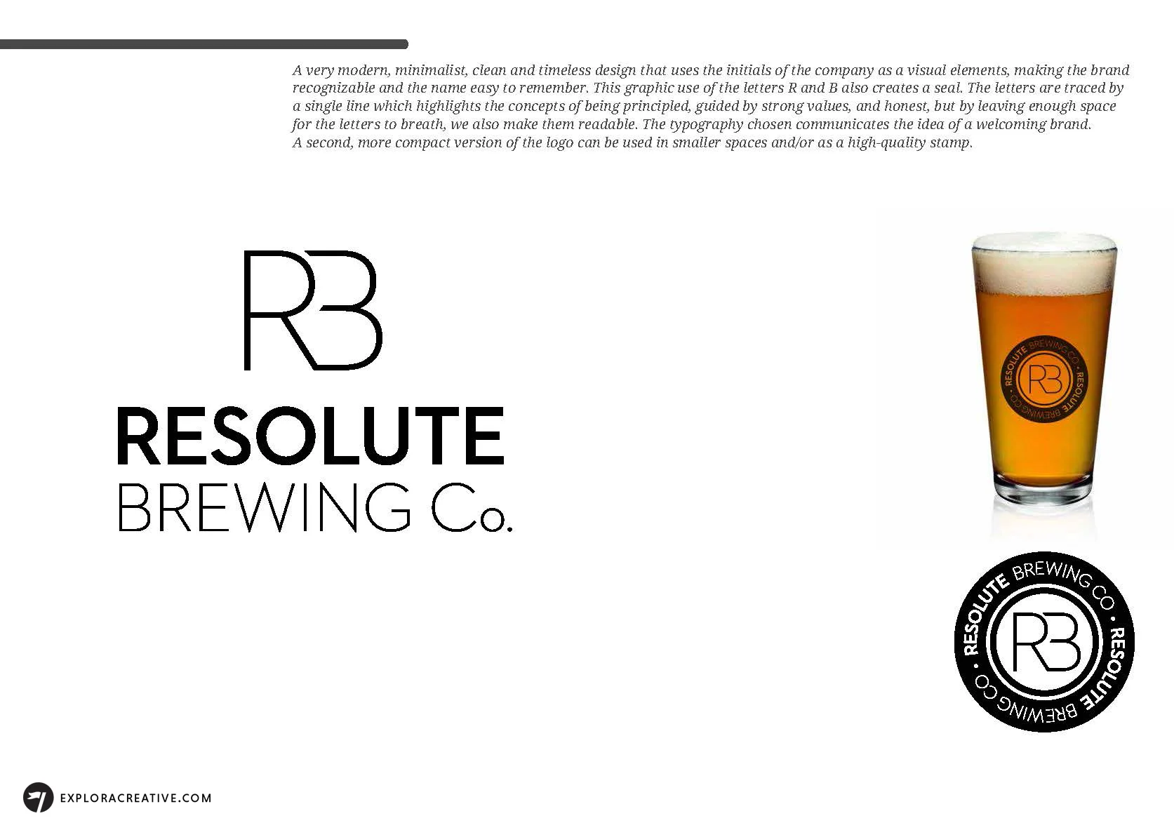
Alternative 4 (Round 1)
This alternative was inspired by modern, minimalist, and clean design styles, using the initials of the company as visual element to make the brand recognizable.
The letters were traced by a single line to highlight the concepts of being principled, guided by strong values, and honest. Leaving enough space for the letters to breath made them more readable. The typography communicated the idea of a welcoming brand.
Round 2 of designs
With the client’s feedback, I worked on round 2. Resolute selected a couple designs and mixed and match elements from different designs.
At this point we also started exploring color palette alternatives, keeping in consideration the local competition:

Color palette alternatives and local competition
The designs presented included versions in black and white first and then their application to the possible color palettes:
Round 3 of designs
With the client’s final feedback, I set to tweak and finalize the selected design:


We also selected the final primary and secondary color palette:

Final color palette
Final designs and collateral pieces

Brand system: black and white icons
Brand system: color icons

Stationery


Coasters

Social media graphics for events and marketing pages


Application of brand to beer taps and staff wardrobe

Poster design for Collaboration Fest to host both Resolute's and Upslope's brands under one concept. Hand drawn illustration.
Being an entrepreneur is very exciting, but also requires that you consciously take the correct first steps, so your company can have a solid foundation. This is especially true when creating a new brand, because that's the essence of your company. Every single part of the brand system (meaning all visual elements that represent your brand) become the face of your company, so you should make sure it reflects your brand’s personality, values, and tone, so you can reach your ideal customers and grow.
I believe is much better to work in short iterations, involving the client from the beginning and throughout the process. The truth is, we need each other, because I might be a specialist in design, but you, the client, are the expert on your business and you know your company better than anybody. That for me is the best scenario for collaboration, and with an honest, respectful relationship, we can create beautiful, meaningful results.